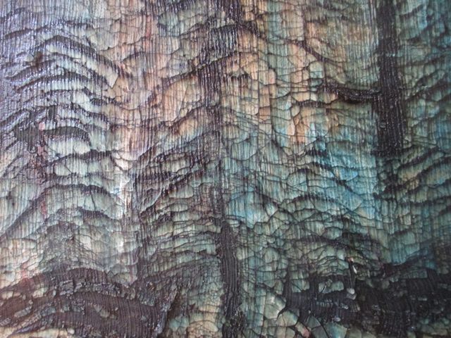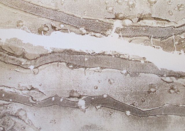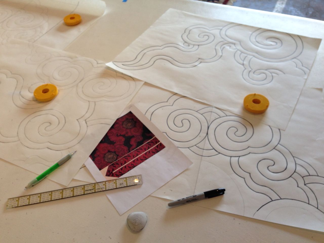
detail from a breakdown screen before printing
Art work is hard work. It’s not hard work like digging a ditch, although it can be physically demanding. It’s not hard work like interpreting the law and representing clients, although it can be mentally taxing. It doesn’t have the high stress of a service job like being a waitress or a cashier, unless you count trying to ignore your inner critic.
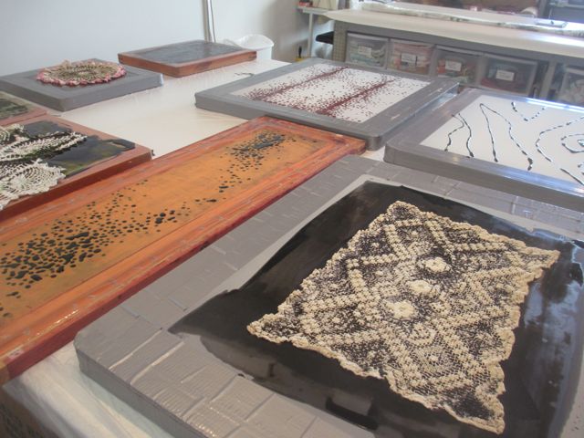
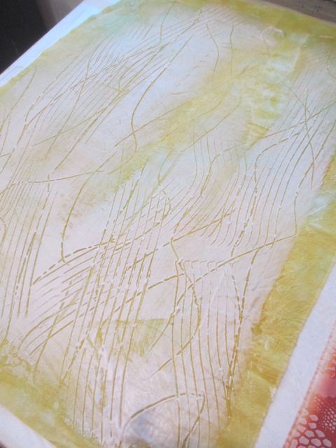
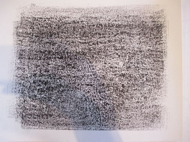
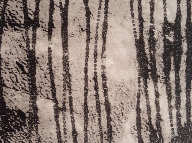
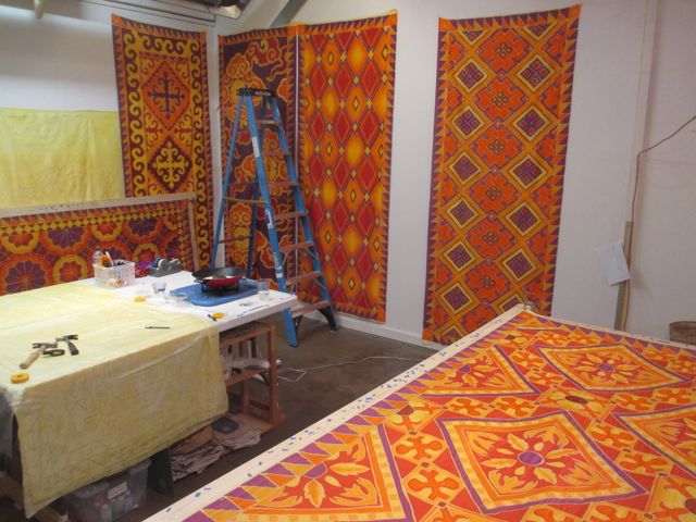
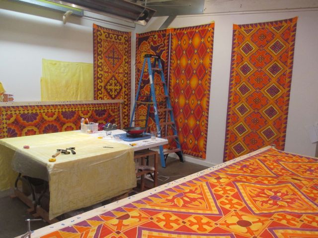
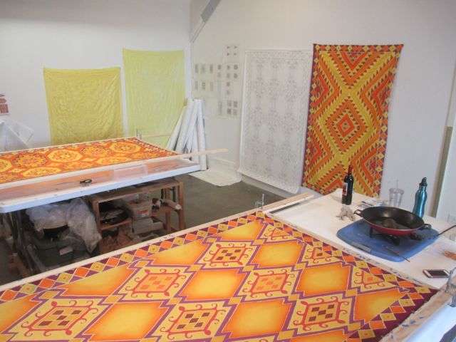
breakdown screens set up to dry
What’s hard about making art is harnessing introspection, perfectionism, focus, and inspiration, into some kind of tangible “object” and showing up until it reaches that magical state of being “finished.” Somedays every motion in the studio takes tremendous energy, fighting self-doubt all the way. Some days, the work is satisfying, fun even, reaching that elusive “flow” state.
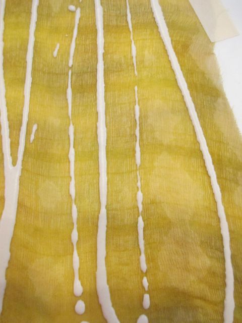
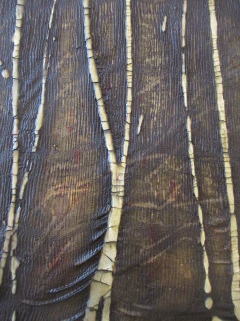
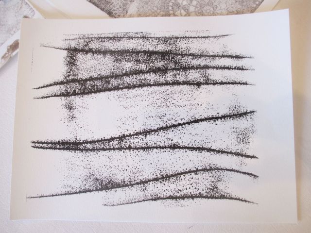
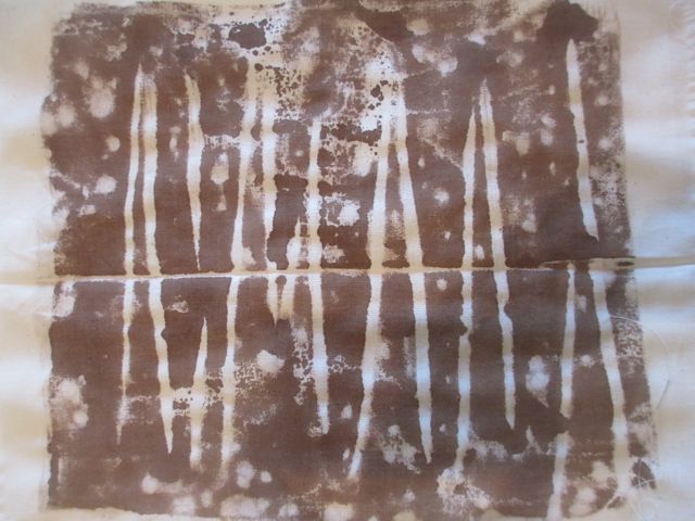
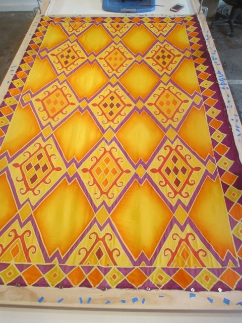
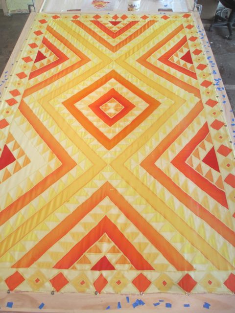
printing with a breakdown screen
After over ten years as a studio artist, I know the most important thing for me to do is just to show up, even if it’s only to sweep the floor. Lately, I’ve been finding lots of ways to distract myself from being in the studio and many of them are part of being an artist, like writing proposals and grants, keeping up with email, teaching workshops. These, although important, pull my mind away from the work, the hard work of creating.
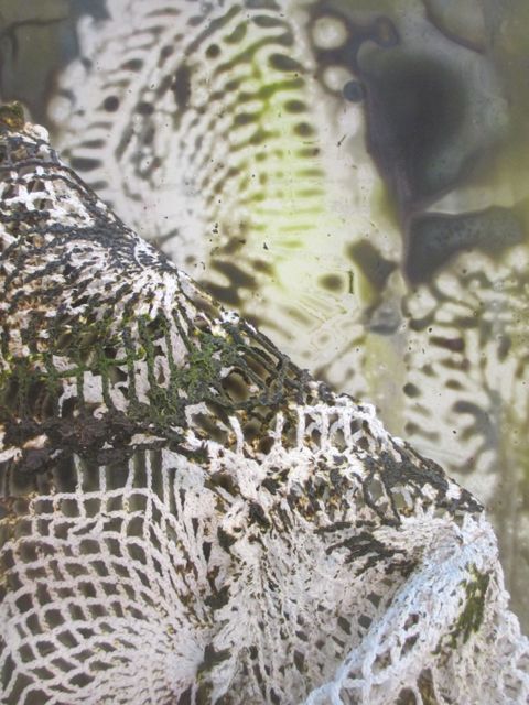
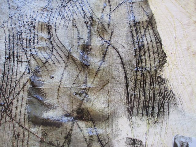
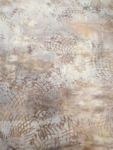
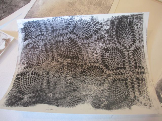
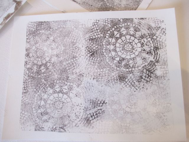
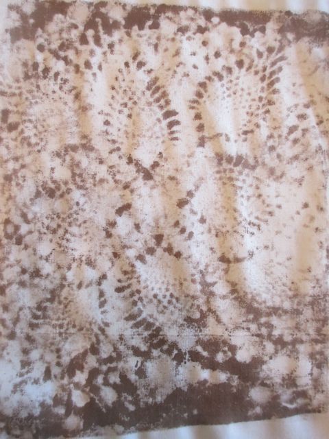
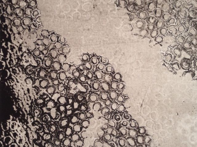
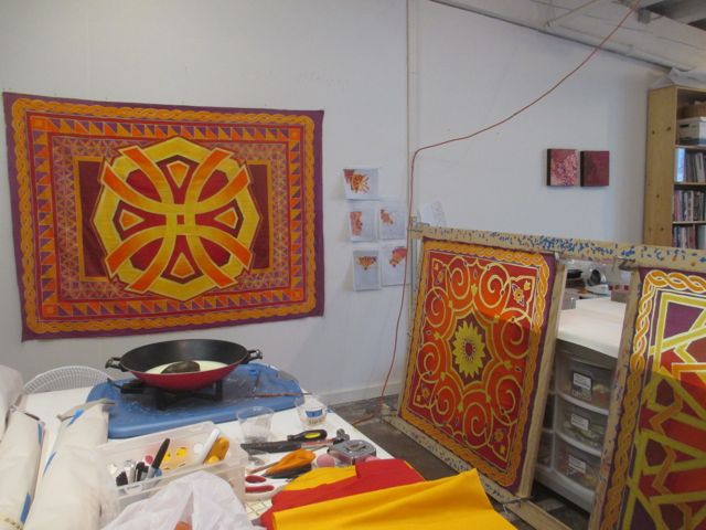
removing a doily used to create imagery on the dried screen
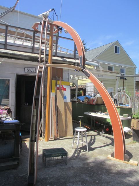
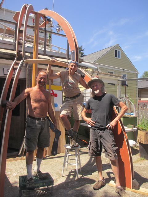
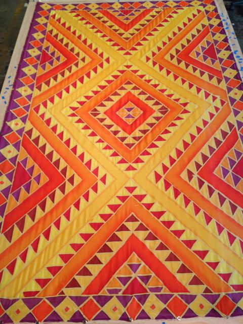
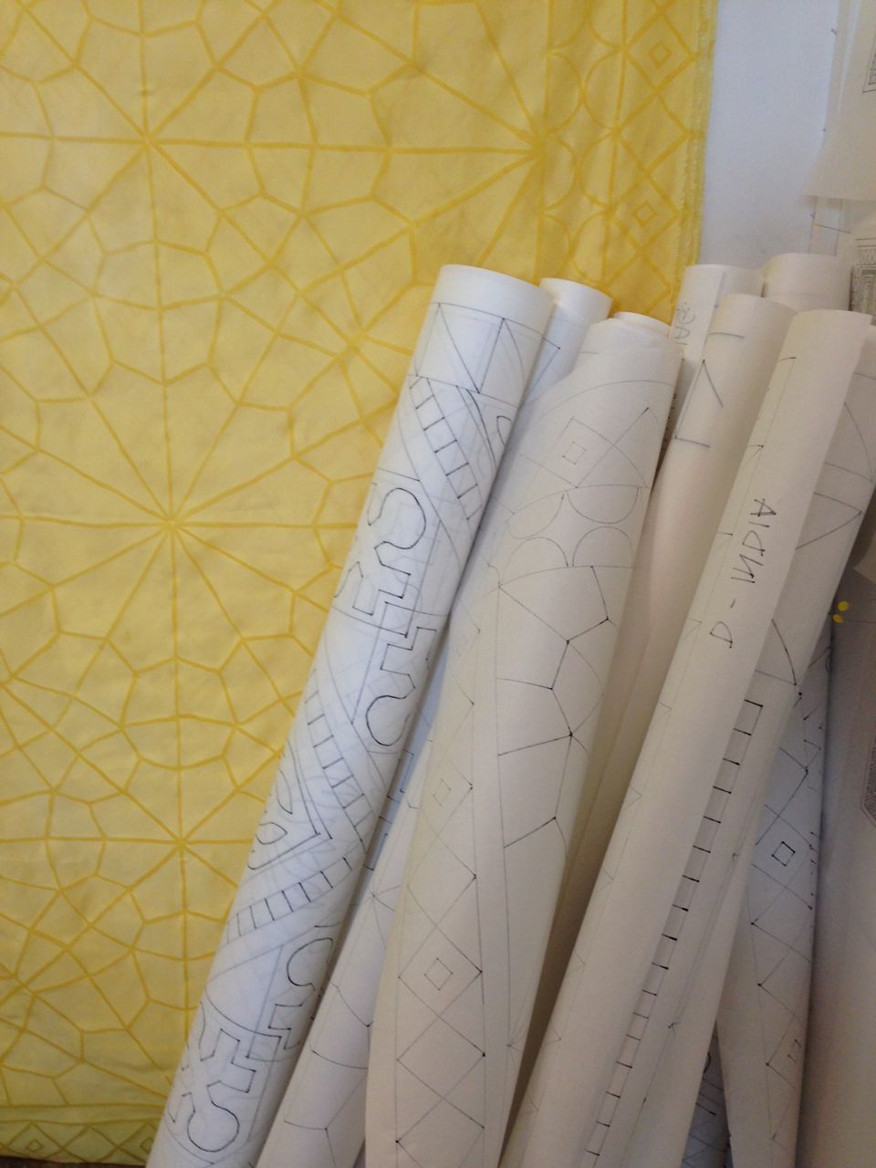
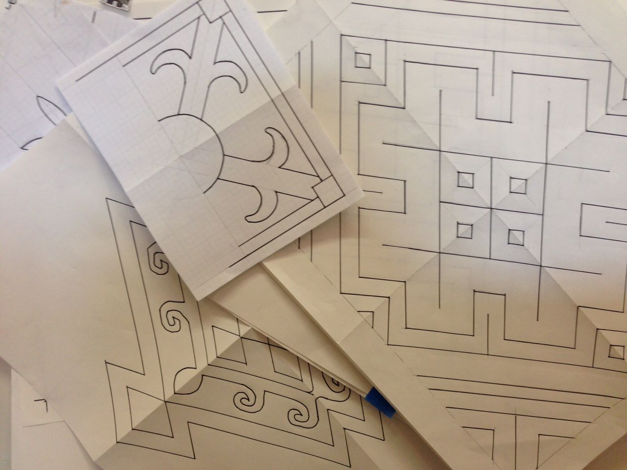
And even though it doesn’t feel like it, I have been working. A body of work based on driftwood is starting to take form. I’ve had paper patterns for seven new sculptures since February that keep getting moved around the studio to be out of the way. I’m trying to reinvent (again) how I work on the wall. It’s exciting and yet I find that I’m stopping myself from moving forward.
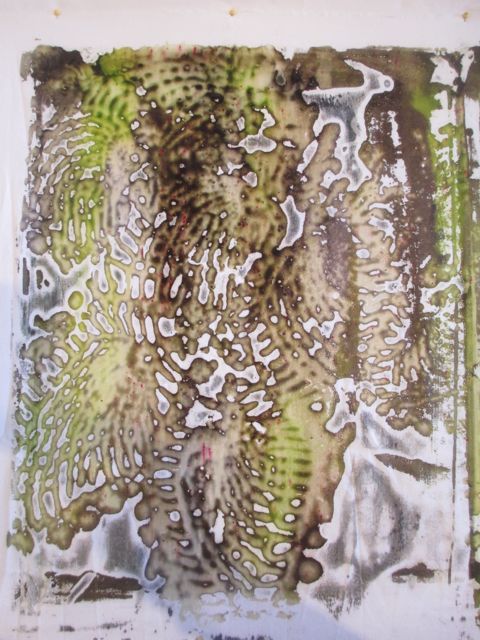
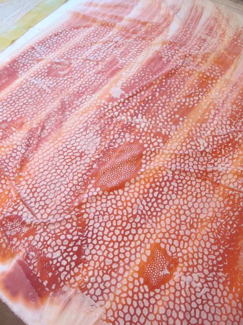
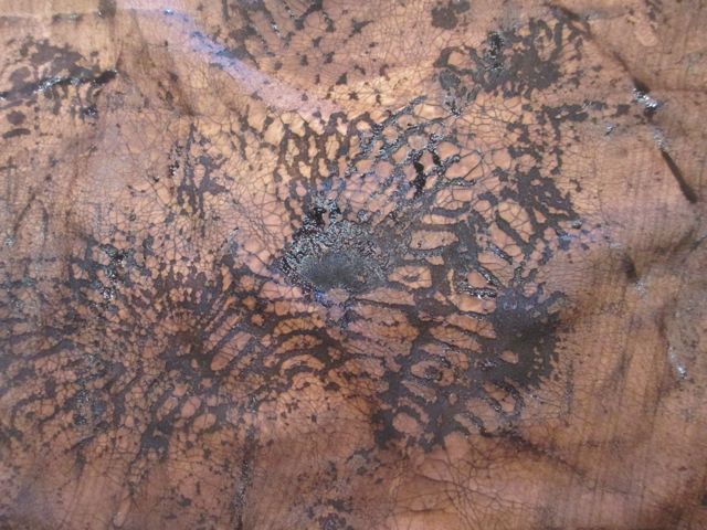
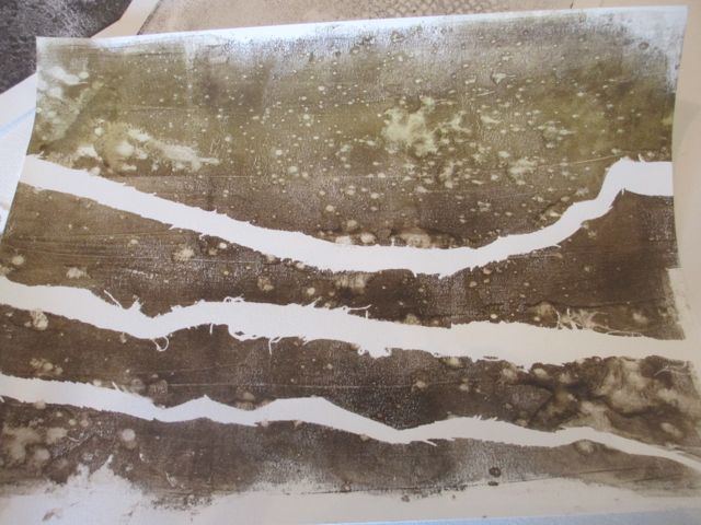
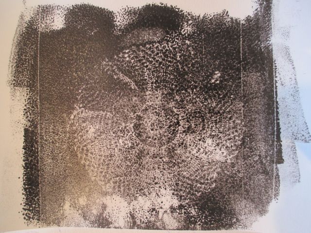
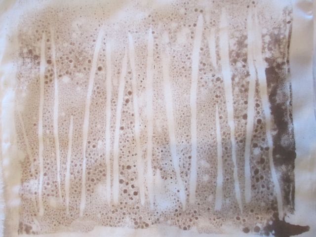
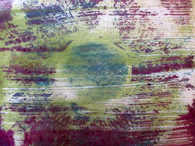
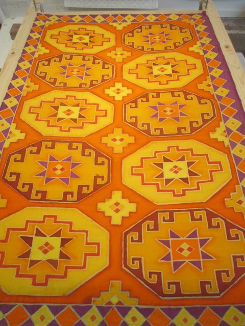
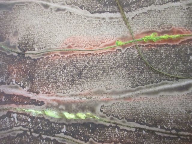
first print from the doily screen. you can see the red “freckling.”
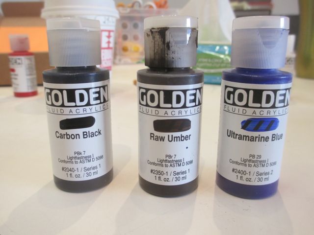
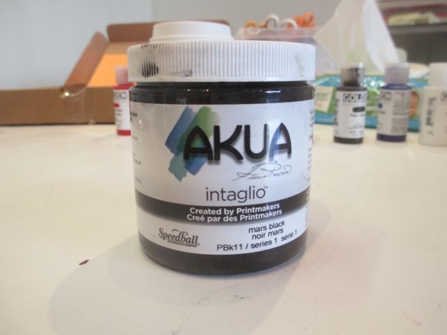
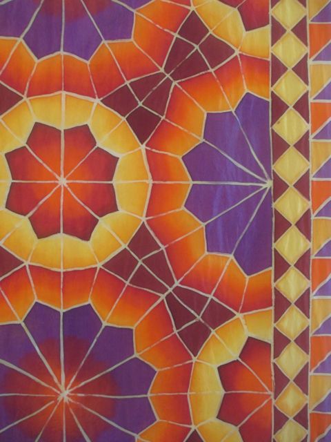
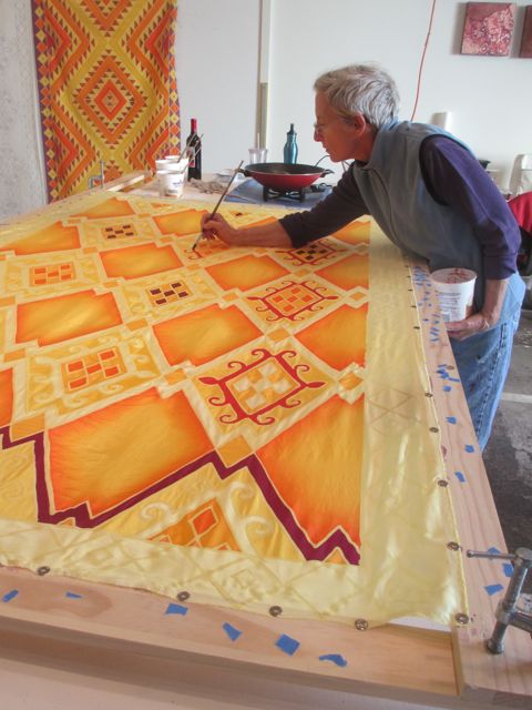
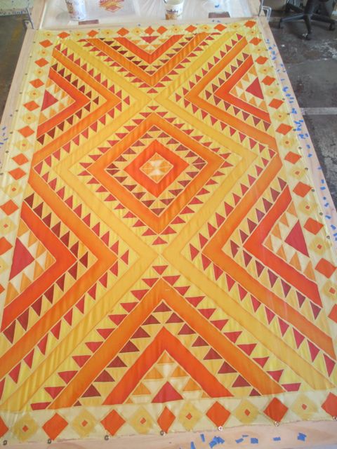
This past week in the studio I printed some breakdown screens and monotypes on fabric based on driftwood imagery. I like some of it. Some of it was just frustrating because I had technical trouble with the dye “freckling.” I spent some time on the phone with Nancy at ProChem and she had some advice that I’ll try the next time. But take my advice and avoid “Rust Orange” when doing Breakdown.
I think that “showing up” here on the blog is another part of my practice, one that has been largely missing the last few months. It’s another kind of accountability to myself, to reflect and record on my process. Let’s call this post a good first step on my way to the studio.
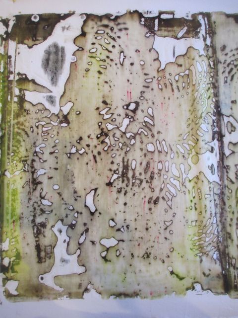
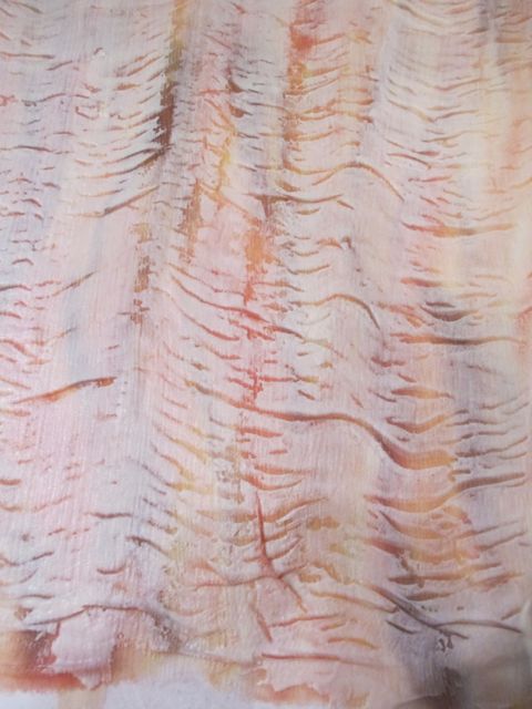
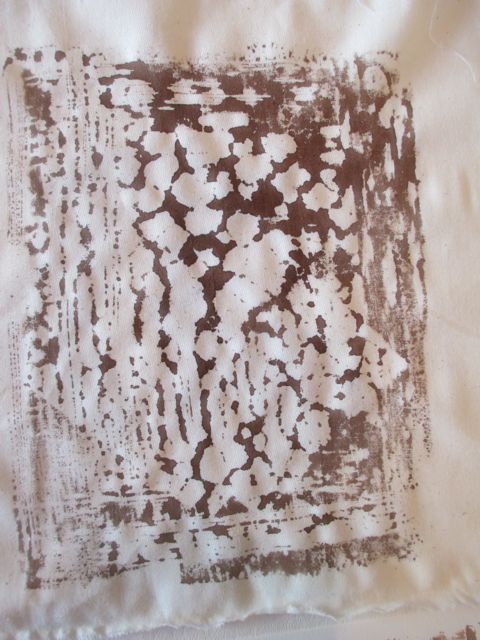
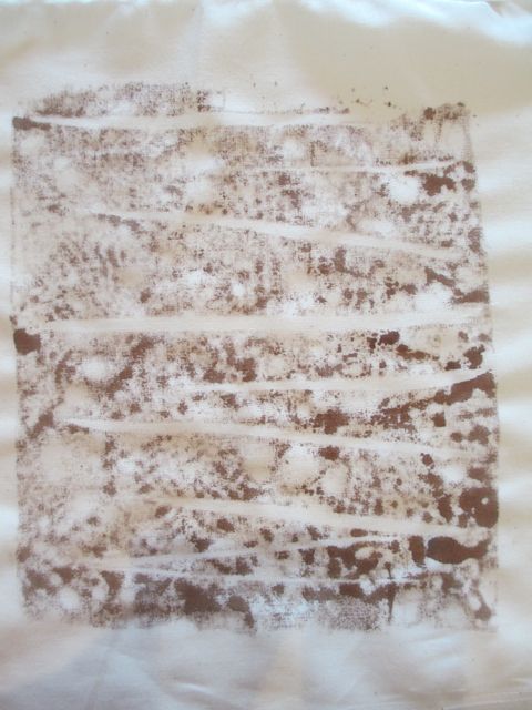
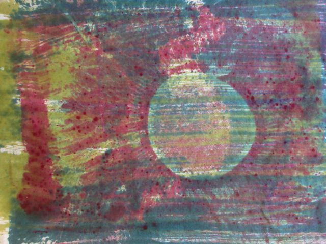
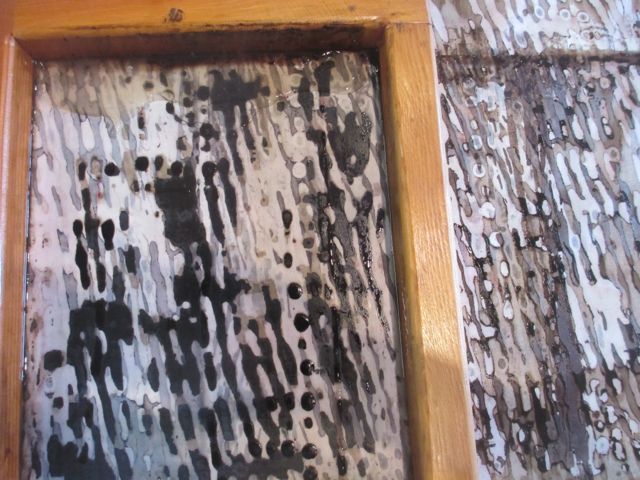
second print from the doily screen with more freckling