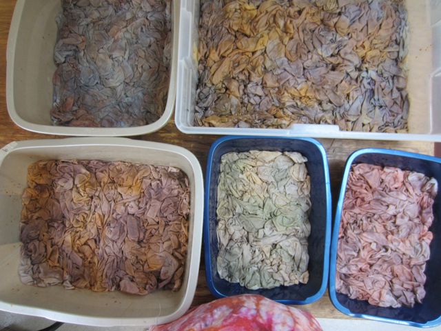
dyeing in a muted palette
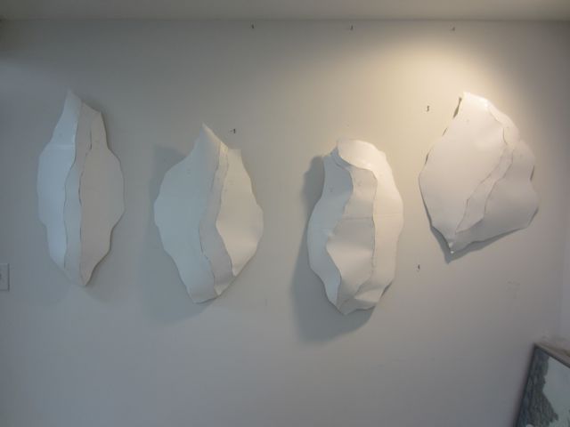
For this next series, which for now I’m just calling “Boulders”, I’m working with a much more muted palette. The idea is to emphasize the form and stitching rather than the surface design.
Oooh, this is so hard for me! I love color and texture. It’s like a drug for me. I’m just so in love with it that I think stepping away from it for a little while is a good idea.

the "boulder" forms
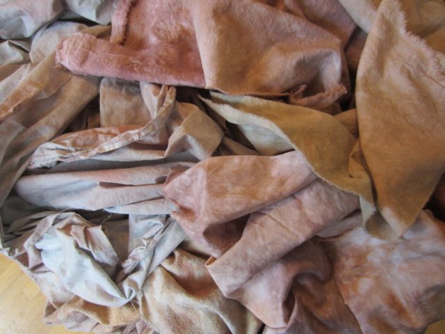
I’ve worked with lighter colors all Fall but really, I’ve only gone as far as mid-tones. So I took another step away from value in this dye session and lightened up my colors even more. There are several challenges in working with really light tones. One is that you can end up with pastels that look a little too much like a trip to the candy store. The other is keeping visual interest while muting the color.
I’ve also been turning my process on its head a bit with this body of work. Usually I dye a whole lot of fabric and then play mix and match with the fabrics and the forms. This time I’ve designed the forms first and then picked out focus fabrics in midtones from the fabrics I dyed this Fall. Then I used those focus fabrics as a starting point to dye light fabrics for the rest of the panels on the forms. I think it’s good. I think it’s going to work.
Once I ironed out these grays I was really surprised and happy at how much I like them. There are a few disappointments and a few gems, as usual in a batch, and at least one has a little more color than I planned, but there are definitely usable and I’m looking forward to working with them.

