I’m coming to the end of two weeks of intensive dyeing. It’s been deeply pleasurable to dye each day. It’s so much fun to change white fabric into multi-colored and textured pieces of cloth.
Because I’m working in a really specific colorway and I’ve already designed the patterns, these two weeks have been very focused. But even though I was working within narrow parameters I still found a lot of freedom in the work. Some of the sense of freedom is because I’ve been trying new techniques. It’s always exciting to try something new and even better when it is successful. I also used some of my tried and true techniques like breakdown printing and flour paste resist. They still feel new and exciting to me after all these years. Perhaps it’s because there’s a sense of mystery in these techniques. You don’t know what you have until the print is revealed or the flour paste is scraped away.
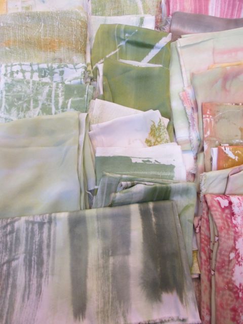
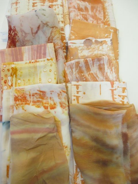
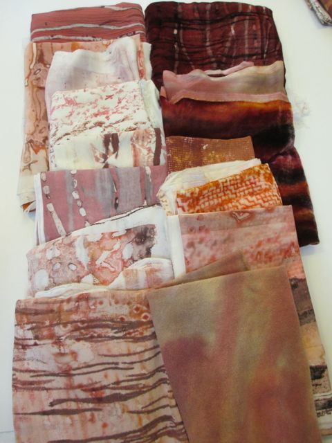
The palette that I’m working with is based on the colors of the Madrone trees: light green, golden yellow, terra cotta, reds, and dark brown. Surface design techniques I’ve used include direct painting, breakdown and other printing, and flour paste resist. I still need to overdye or paint many of the fabrics to quiet down the white, but I feel very good about where I am now. That’s good because I’m heading off to Costa Rica tomorrow morning!
Following are some photos of the fabrics organized by color.


