Even the Hummingbird Pauses

humingbirdHere we are, poised on the edge of the new year. It’s a time for reflection, for taking a deep breath, looking back and looking forward.

It’s time for me to finally leave Playastan behind and move on to new work. I took a little time away from the holiday home scene yesterday to tidy up the studio. I have trouble moving forward with new work with the studio in disarray. The mess is for when I’m deep in projects, the detritus of progress building up on horizontal surfaces and amassing in drifts in the corners. For now, the surfaces are clear and ready for the next thing.

I’ve decided that the time is done for dithering around, wondering what to do next. I have the urge to make new work. It’s been too long since my hands manipulated materials, too long since I loosed both my creative and critical minds.

I spent some time yesterday looking through  sketchbooks from as far back as 2009, marking drawings that have promise but haven’t been developed. Then did some drawing from those sketches, teasing out their essence, making marks and visualizing them as objects. Next week I’ll start building in three-dimensions, following the familiar road back to productivity. Now isn’t the time to reinvent myself and my work, it’s time to get busy.

Anna’s Hummingbirds visit my garden year-round, feeding on the flowers of the arbutus uneedo (Strawberry Tree) this time of year. They have been pretty quiet during the cold and wet weather we’ve been having. When the sun comes out they zoom about, feeding and warming themselves before the clouds move in again. I got a photo of this one resting in the sun in our cotinus coggygria, or Purple Smoke Bush. Even the hummingbird pauses, perhaps for a moment’s reflection, before whirring off into the future.

A Walk in the Park

IMG_3613

maples at the Washington Park Arboretum

IMG_3607

berries of the iris foetidus

Oh, the news. The bad, bad news out of Ferguson. It’s a gloomy day here in the northwest corner of the country; rainy and dark without much chance of clearing either in the skies or in the newspaper.

In this week of Thanksgiving, the differences between the haves and the have nots seems even starker. In our warm and comfortable home we are happy to have our older daughter home from college for the holiday. It’s such a joy to hear her excitement in what she’s studying, to see her embrace the life of the mind. At dinner I watch as she and her sister tease and laugh, sharing puns and the clever inside jokes of a lifetime raised together in a home with easy access to education.

IMG_3600

a decaying gunnera leaf


Seattle is a segregated white city, and getting whiter and more segregated all the time. We are generally spared seeing overt images of racism in our day-to-day lives. Or maybe it’s just the blinders we are wearing as we go from task to task in our reliable cars to our well-paying jobs.

I had a rough time growing up. My parents divorced early. We were on welfare, got food stamps. I was ashamed to be on the free lunch program at school. My mother moved us from place to place, always thinking some place else was better than where she was. Her struggles with mental illness still color my experience.


IMG_3644

the fruit of the medlar tree

But somehow I escaped those circumstances. Being smart helped. And being white helped, too. I got some higher education, (didn’t graduate but that’s another story), got some therapy, and remade my life. I met and married a wonderful man, had two beautiful, intelligent girls, and live a comfortable middle-class life. Not everyone is so lucky.

My younger daughter is taking American History in high school. Right now they are studying the Constitution, reading it and transcribing it into modern English. Last night, after hearing the news the the grand jury in Missouri had declined to indict Officer Darren Wilson in the death of MIchael Brown, she came to me as I folded laundry. She said she just couldn’t do her homework, that reading the Constitution was just too depressing. That those beliefs that our country is founded on still don’t apply to people of color. She’s right, of course.

Our lives are a walk in the park.

IMG_3634

fallen leaf from a plane tree


Further Explorations with Monotypes

print opener

printing up a storm in the studio

I’ve been intrigued enough by making monotypes on both the homemade gelatin plate and the commercial Gelli plate to explore in a more systematic fashion. So far, I’ve tried four different media, Speedball water-based printing ink, thickened dye, Golden Fluid Acrylics, Akua soy-based ink, and Dy-Na-Flow paint. Each gives different effects, each has its benefits and weaknesses.

My first experiments were with the Speedball water-based inks. I got some great effects on the Gelli plate. The ink rolled out beautifully and I got wonderful detail. The downside to the water-based ink is that it isn’t permanent. I tried to use some washes over the top, and even after drying and applying a spray matte fixative, the ink ran when I applied anything with water.

Thickened dyes gave me some good results, although the alginate thickener is problematic for monotypes. The nature of the alginate (like a big pot of mucus) makes the prints blobby and streaky. Interesting in its own way but not a smooth background. My blog post Printing with Gelatin details these trials.

print g paints When I got back from New York I tried Golden Fluid Acrylics. These gave me just terrific results on the gelatin plate. It brayered out beautifully and gave me crisp details and interesting positive/negative effects. I haven’t tried them on the Gelli or the plexi yet. Those experiments are up next.

print g gel

Golden Fluid Acrylics on the gelatin plate

print g gel strips

another print with the Golden

print g detail

detail of a “ghost” print with the Golden

print a on gel

Akua Intaglio on a gelatin plate

print a gelli

Akua on the Gelli plate

print a on gelli 2

Positive Akua ink of the Gelli plate

print a inkNext printing session was with Akua soy-based Intaglio Inks. I tried them on three different printing substrates: the gelatin plate, the Gelli plate, and a plain old sheet of plexiglass. Again, different results with each type of plate. On the gelatin the ink didn’t roll out smoothly. It gave a “pebbled” surface, which I kind of like since I’m all about visual texture, but didn’t afford the kind of detail I got with the paints. I got a better result on the Gelli plate, but again, not as crisp as with the paint on the gelatin. Interestingly, I got really great results on the Gelli plate when I pressed the inked up doily onto the plate and then printed the “postive” image rather than the negative. My third try was on the plexiglass and that didn’t work at all with the doily I was using to make marks.

print a plex

Akua ink on plexi

print a draw through

Trace monograph using Akua on plexi

The one thing that worked better with the Akua on the plexi was a Trace Monotype (also known as a Draw Through). A trace monotype is when you ink up a plate, put a piece of paper (or fabric) on the surface and then draw on the back of the material to create a design. I’ve done this with inks and with thickened dye and love the effect, especially because you can then create a negative of your drawing by printing what’s left on the plate as a “ghost” print. This technique didn’t work at all with the gelatin or the Gelli, perhaps because I was afraid to really press in case I permanently damaged the flexible plates.

print d gel doily

Dy-Na-Flow on gelatin

Last test was today with Dy-Na-Flow paints. The paints are specifically for fabric and have a very light hand. They are quite “watery” and formulated to work much like dyes. I’ve used them for batik when dye wasn’t appropriate. I figured that they might work much like the Golden Fluid Acrylics. Well, they did and they didn’t. I wasn’t able to roll the paint out with a brayer because it’s much thinner in body than the Golden. I applied it with a foam brush to the gelatin plate, the Gelli plate and the plexi and again, got different results with each. Surprisingly, it worked much better on the gelatin and the plexi than the Gelli. It completely separately on the Gelli, and though it made an interesting texture on its own, I wasn’t able to make any marks into the medium.

print d gelli

Dy-Na-Flow on Gelli

IMG_3581

Dy-Na-Flow on gelatin plate

IMG_3582

“ghost” print of Dy-Na-Flow on gelatin

The best results were on the gelatin plate. The paint created an interesting “bubbly” texture which carried through to a second “ghost” print. The plexi results were okay, got some detail but the application wasn’t very thick so the color is light in value.

More testing to come with different media, different kinds of paper, and layering. I’ve already gone through over 300 pieces of paper. One of these days I’ll have to figure out what to do with them, but for now it’s just fun every day in the studio.

print d plex

Dy-Na-Flow on plexi


Walking in NYC

After seeing art and eating, the best thing to do in NYC is walk the parks and neighborhoods. Here are some images from my recent trip to the big city.

IMG_3461

The Castle in Central Park


IMG_3346

afternoon sun on the buildings


IMG_3335

New York schist with horse and buggy

IMG_3341

gingko leaves

IMG_3374

plantings on the High Line growing up through the original rail line


IMG_3368

chartreuse shrub in the afternoon light

IMG_3378

old and new along the High Line

IMG_3383

graffiti on the street in Chelsea

IMG_3432

Mondrian scaffolding?


IMG_3443

street view in Chinatown

IMG_3440

wares for sale along the street in Chinatown–now I wish I’d bought some rather than just taking a picture

IMG_3441

still life in a bin

IMG_3442

lovely abacuses (or abacusi?)


Art Highlights from a Short Trip to NYC

Egyptian Temple at The Met

The Temple of Dendur at The Met

I got back a couple days ago from New York City. The impetus for the trip was to see the Matisse Cut Paper show that had traveled from the Tate in London. It was fun to be in the big city. My travel companions through four museums, multiple galleries and neighborhoods, and some adventurous eating were my husband and my 16-year-old daughter.

Firstly, Henri Matisse: The Cut Outs did not disappoint. It actually exceeded my expectations. Unfortunately, but not surprisingly, photography was not allowed in the exhibition. I would have loved to capture images of the meticulously layered works, but not having my camera forced me to be in the moment and let the works in through my eyes. It was fascinating to see how Matisse, often through the hands of his assistants, layered small pieces of colored paper over a larger shape changing the shapes fractionally until they were right. According to wall text, when working on the Blue Nudes he labored over the first one, Blue Nude #4, for days to get it right. The deceptively simple shapes of the composition are made up of many small bits of colored paper. Getting that perfection then apparently loosened his hand. The other three Blue Nudes in the exhibition appear effortless, each shape flowing from a single cut.

It’s amazing to think about what an innovator Matisse was, that this way of working hadn’t been done before, or at least not as finished art. The freshness and the vigor of the artist come through when seeing the works in person. Multiple pinholes are visible in the paper, a testament to the artist’s thought and process. There is a dimensionality in the layers of the papers, wrinkles and edges, that can’t be seen in reproduction. Go if you can! The exhibition is at MoMA until February 8, 2015.

IMG_3320

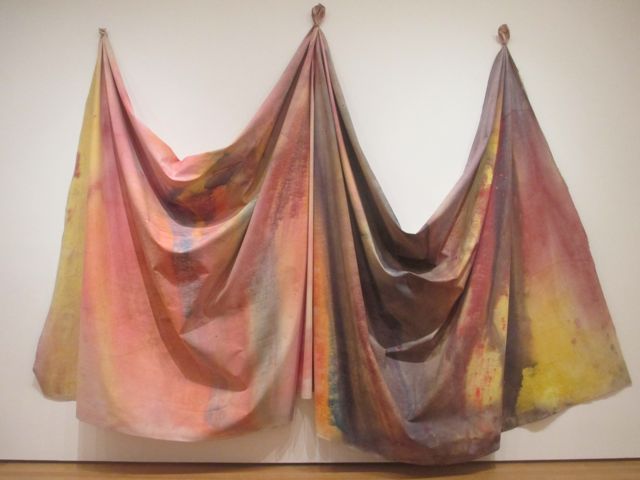
10/27/69 by Sam Gillian

After spending an hour-and-a-half in the Matisse exhibit, we wandered some through MoMA. I was particularly drawn, big surprise, to those artists who were working with fiber-based media and taking it from 2-d into 3-d. This painting on canvas by Sam Gilliam from 1969 becomes sculpture by the act of gathering and tying the material. Canvas is fabric, fabric is dimensional.

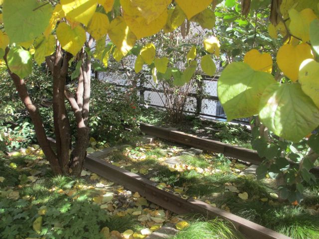
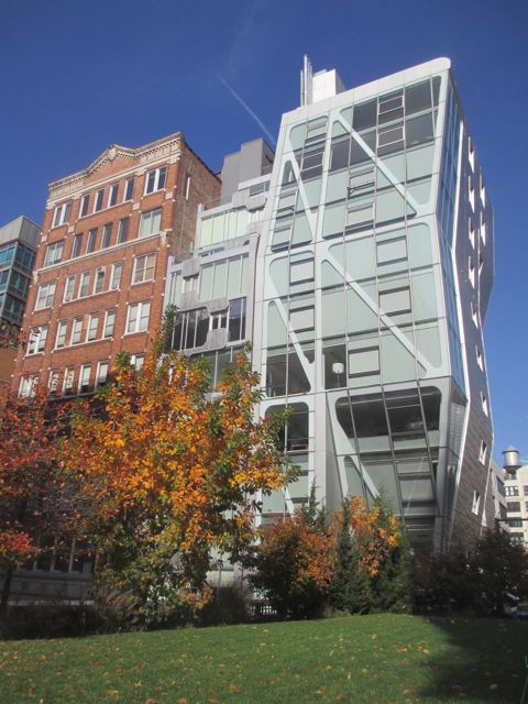
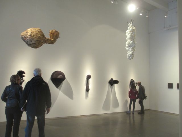
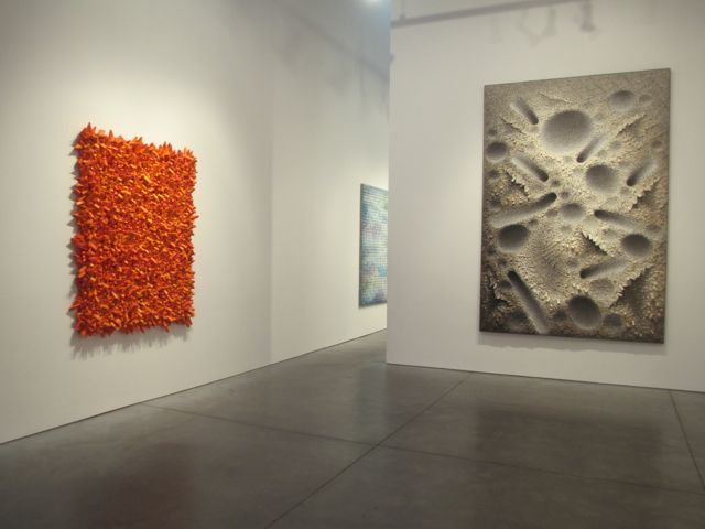
The next day we walked the High Line and visited some galleries in Chelsea. Even though I hadn’t done my homework on which galleries to see, we struck gold. Three that stood out were El Anatsui at Jack Shainman, Shea Hembrey at Bryce Wolkowitz, and Kwang Young Chun at Hasted Kraeutler.

IMG_3396

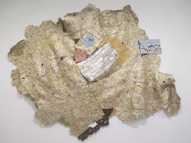
piece by El Anatsui at Jack Shainman Gallery

IMG_3397

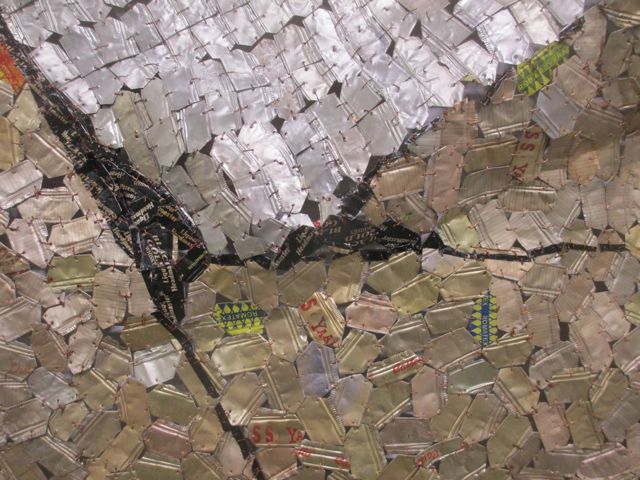
detail of El Anatsui piece showing the intricate shaping and tying of mundane materials–the metal wrappers of alcohol bottles.

At Jack Shainman, El Anatsui’s show, Trains of Thought, showed six large pieces, including one piece that was free-standing rather than wall-hung. The large pieces sparked with energy and intention.

IMG_3387

Shea Hembrey: Multiverses, installation shot at Bryce Wolkowitz

Shea Hembrey: Multiverses at Bryce Wolkowitz was presented as the work of five artists working in different media and curated by Hembrey. In actuality, each “artist” in this compelling show of paintings and sculpture was a persona of the curator, a fact stated only on the last page of the show’s catalog. Although I didn’t know it when I viewed the show, I had a keen sense of the interplay and through-lines of the works, and interestingly, responded more to some pieces than others. It brings up issues I’ve talked about with other artists, about being defined and hemmed in by success with one media or style. Perhaps the answer is for all of us to become five artists instead!

IMG_3427

Kwang Young Chun at Hasted Krauetler Gallery

IMG_3415
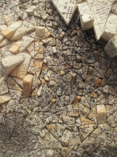
The Kwang Young Chun show at Hasted Kraeutler blew my mind. The 70-year-old Korean artist creates dynamic, labor-intensive works that blur the line between painting and sculpture, between two- and three-dimensions. Triangles of polystyrene are wrapped with Korean mulberry paper and tied, then affixed and painted to create layered fantastic landscapes. The interplay of dimension and color-field were mesmerizing and compelling.

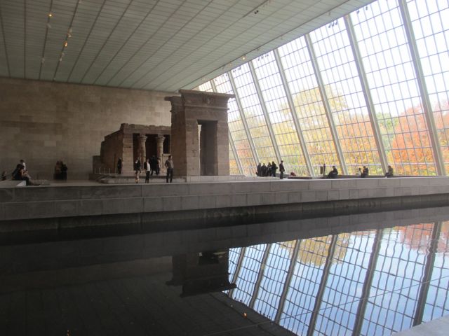
On our last day we visited the Metropolitan Museum of Art and saw Death Becomes Her, a show of 18th and 19th Century mourning clothes. It was beautiful and somber, the stories and culture as interesting as the design and workmanship of the clothing. It’s crazy to just have two hours to spend at the Met, but that’s what we had. We zoomed through a odd collection of greatest hits and spent time looking at the musical instruments for the musicians in the family.

IMG_3471

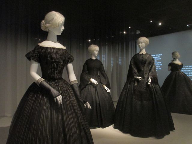
installation view, Death Becomes Her at The Met

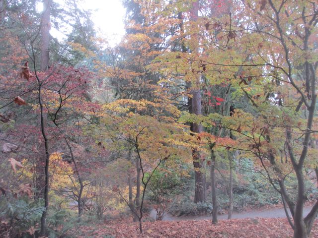
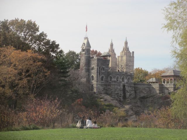
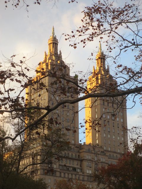
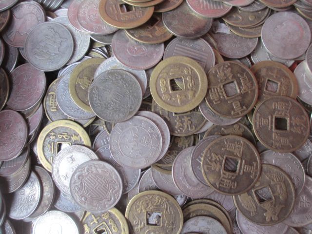
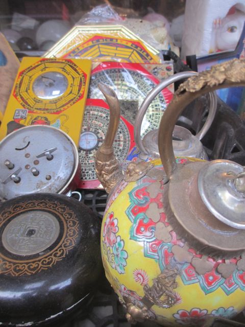
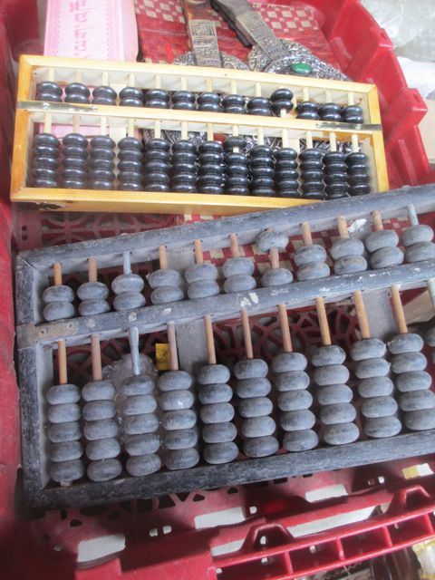
In all, we visited the Museum of Art and Design (and lucked into being at the opening of New Territories, art and design from Latin America), Museum of Modern Art, The American Museum of Natural History, the Metropolitan Museum of Art, and a number of galleries in Chelsea. Add in walks through Times Square, Chinatown, the Lower East Side, Central Park, and Little Italy. It was a thrilling, exhausting, and inspiring three days!


Printing on Gelatin

photoI’m new to gelatin printing, both with the Gelli Plate and by making my own gelatin plate. I’d heard about it for several years but thought, why not just use a sheet of plexiglass? I bought a Gelli Plate about a year ago on a whim. It was kind of spendy, $30 for an 8 x 10 inch sheet, but I thought I’d try it out. I took it home and promptly forgot about it.

Sometimes when I’m feeling a bit dry in the studio I’ll pull out paper and ink and do some monotypes. A few weeks ago I bought a bunch of paper with the intention of just getting some ideas down on paper to free things up in the studio and I rediscovered the Gelli Plate.

Wow! It’s really fun and kind of addictive. I pretty quickly went through about 200 sheets of paper. I like the marks I made with Speedball water-soluble ink. The Gelli Plate picks up really great detail and makes terrific “ghost” prints so that I can work with positive and negative imagery.

photo 2 photo 3 photo 1Yesterday I tried the plate with thickened dye. The instructions for the Gelli said not to use dye on the plate because it will stain–but the Speedball ink had already done that, so why not? Thickened dye doesn’t act like paint, it kind of streaks and blobs because of the nature of the alginate thickener (kind of like snot, really).  You can’t brayer it out the way you can with ink or paint. I spread the dye as evenly as I could with a plastic spreader and then used a doily for visual texture. I still got the characteristic streaky look but I think it holds better on the Gelli than on the plexiglass.

Here are a few images from yesterday’s dye session. I was inspired by the colors of the faded hydrangeas I photographed in our Arboretum. I think the images are just okay, I forgot to fully mix the Maroon dye and it left spots. Argh! But I like the layering technique and am looking forward to more exploration.

IMG_3233 IMG_3229 IMG_3228I’m excited about this new tool but I’m frustrated by the size of the plate. The larger 12 x 14 inch plate is $70 so I’m working on making my own gelatin plate.

I’ve read the on-line tutorials and it seems pretty simple but so far I’ve made some dumb mistakes. On my first attempt I didn’t let it set up long enough before I tried to move it and it broke up into little pieces. I threw it out before I realized you can remelt it and reset it. Second attempt I jiggled it before it was set up and made a bunch of ripples in it. Damn! The good news is that once I put it in the fridge for a couple hours I was able to take it out of the pan and it looked like the ones I’ve seen on-line (with bonus ripples). I took a few prints off it anyway using dye on paper and promptly stained it! Results were meh.

I think this is what they mean when they talk about trial and error.

Tomorrow is another studio day and I’m going to try again. This time paint! I’ll report back with more pictures.


Dreaming and Scheming

IMG_2453

seeds of ideas

I’m putting together a series of workshops that I’ll be teaching in my studio starting this Fall. It’s a surprising amount of work: planning the classes, writing descriptions and supply lists, scheduling dates, and updating the website for on-line registration. Then there’s getting the word out to potential students. It seems the teaching is going to be the easy part!

I’m really excited about the program, though, and the idea of teaching and forming a community of dyers and other surface designers. I’m looking at it right now as a two- to three-year plan. In the next six months I’ll offer a series of workshops covering surface design fundamentals. Next year I’ll offer more advanced techniques. Ultimately, I’d like to work with a group of committed students on building their practice as artists, to whom I’d also offer mentoring through one-on-one meetings.

In the next six months I’m planning on teaching (drum roll, please):

Dyeing for Quilters (and Other People Who Love Fabric)

Telling Your Story with Silk: Making Silk Batik Banners

Surface Tension: Complex Results Using Low-Tech Resists

The Printed Surface: Mark Making Using Thickened Dyes

That’s my dream, anyway. First things first, plans and website.

Look for the registration to go live in a few weeks. Also, let me know if you’re interested in getting more information, or know others who would be interested.


There and Back Again

photo 1Wow. I am proud. I am humbled. I am filled with gratitude.

Peter Weston and me, the proud parents, with the central banner of Playastan.

Peter Weston and me, the proud parents, with the central banner of Playastan.

It’s hard to put into words the experiences of the last few weeks. Playastan Crossroads was a huge success, not only for how it looked, but for how it created a sense of place, an intimate space within the huge spectacle that is Burning Man.

Sunrise at Playastan Crossroads

Sunrise at Playastan Crossroads

visitors watching the sun rise

visitors watching the sun rise

Many things happened at Playastan Crossroads: art tours, weddings, deep conversations, weary sleep, shelter during whiteouts, and at least one late night dance party. Books were read and added to, love was proclaimed, and apparently there was a blow job, or least one was recorded in the Journal. The stories and images are still filtering in through a haze of dust.

A dusty day in Playastan

A dusty day in Playastan

the Journal, made by Anna McKee

the Journal, made by Anna McKee

young yoginis

young yoginis

a father and daughter take shelter

a father and daughter take shelter

For now we are cleaning, washing, and putting away. The future of the project is unclear. Peter is making repairs, touching up paint, and making ready to put the structure away until it is used again. The banners are clean, though faded, now. The corners are  tattered after the beating they got from the wind and sun. The colors are not as brilliant, there is residual dust beaten into the seams, but they are beautiful still.

IMG_3070Today I’m going back to the studio for the first time since the long hours I was putting in before I left. I’ll be ironing the banners, and all the ties and socks that covered the attachments. Ironing is therapeutic for me, there’s something about pressing out the creases, reexaming the marks, the colors, and the imperfections that is calming. It is a kind of meditation to put things right, to carefully put them away.

And it’s a good thing I enjoy it, because there’s a whole lot of it to do.

There are more photos of the build and the event on the Playastan Crossroads page on Facebook. I also have a Cameron Anne Mason art page on Facebook that I update more often than the blog. And I love to hear from you, my audience, either here on the blog or on Facebook.


Almost There

IMG_2637

the playastan rug shop/aka my studio

We are almost there. The banners are painted, steamed and washed. Ann, Cassie and John are finishing up the sewing. Katha is creating a graphic “Field Guide” to the banners. Anna is making the Journal. Medallions are strung. Signs and compass rose are painted. Tickets finally arrived, thank goodness.

the last banners being painted

the last banners being painted

Still to do is packing the vans for the first crew’s departure on Tuesday, pressing and rolling the banners, ironing  scarves, delivering art for a show at the Whatcom Museum, a trip to Costco, groceries, packing up my clothes and toothbrush. Organizing and packing the trailer. Figuring out exactly what the kids are doing while we are gone. Oh yeah, and renewing my drivers license which I just realized expired on my birthday in July.

the proud parents

the proud parents on build day

But it’s close, tantalizingly close. Our test build was a great success. Peter has done an amazing job. Not only is everything beautifully made, but the main structure goes up in a couple of hours. Each element is first class, no corners were cut, nothing is just “good enough.”

I’m starting to get really excited. It was a thrill today when we listened to the description of Playastan Crossroads on Burning Man’s Audio Tour to the art. You can listen here:

http://www.burningman.com/installations/art_installations_audiotours.html

Given how much there is to do before we hit the road early Wednesday morning, this may be the last blog post before our sojourn in the desert is over and we are back in Seattle. If I can find a wifi connection while there I’ll post update from the build on my Cameron Anne Mason Facebook page.

Think of us there in the Nevada Desert, the banners of Playastan Crossroads snapping in the breeze,  the silk glowing in the late afternoon sun, the light gilding the curves of the Pavillion and shining on the beautiful, dusty people of Black Rock City.

IMG_2642